
Case Study
Product Stack Campaign + Revisioned Packaging

© 2026 Marissa Hobson. All creative concepts, artwork, and strategy in this case study are original work and shared for Shaklee conceptual ideation purposes only. Not for reproduction or use without written permission.Elevated ad campaign concept
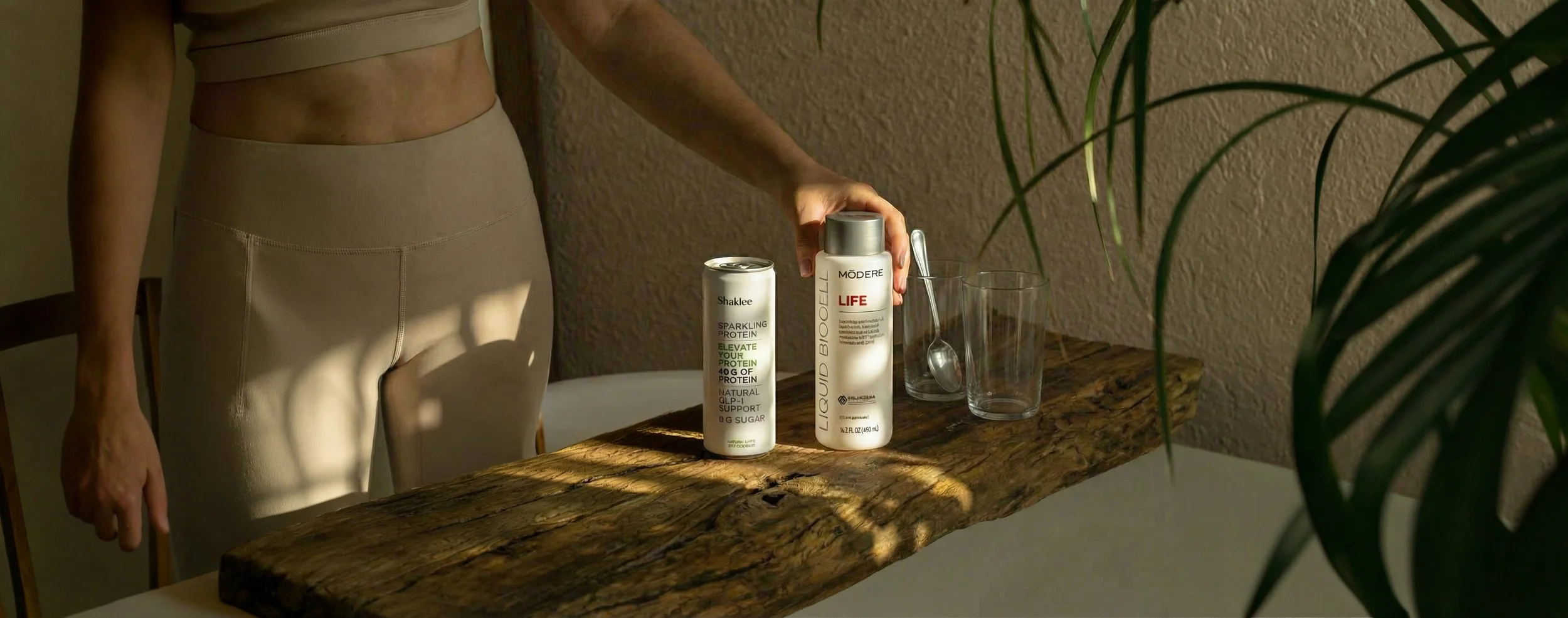
A bold, conversion-driven one-page advertising campaign that positions Sparkling Protein and Liquid BioCell® Life as a single, synergistic daily system supporting strength, structure, and healthy aging.
-
Strategic storytelling
Premium brand elevation
Clear product synergy
Strong visual hierarchy
Commercial impact
-
This campaign should reflect that cultural shift toward strength and simple daily systems, while introducing a modern longevity narrative rooted in ‘Functional Aging’ → biological beauty inside and out.
-
Visual concept
Unifies both products into one compelling system.
Communicates a clear emotional benefit with attention-grabbing visual storytelling.
Drives immediate purchase intent.
Headline, subhead, short-form body copy, proof points.
Use of stock image and existing claims OK.
-
Existing customers
Conversion rate
New acquisition
Product awareness
Consideration

Macro customer mindset
Today’s wellness consumers are shifting from quick fixes and surface-level anti-aging solutions to sustained, measurable results.
Routines
Seeks simple, effective daily systems to follow.
Future-focused
Value strength, mobility, and long-term effects over fast, fleeting results.
Bio formulas
Increasingly prioritizes inside-out wellness with science-backed solutions.
Confidence
Prioritizes self-care and vitality, willing to commit time to get results.
Market & competitor analysis
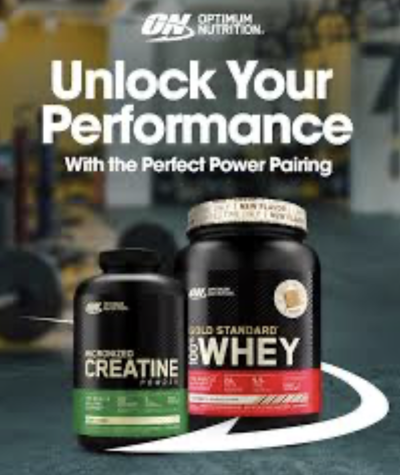
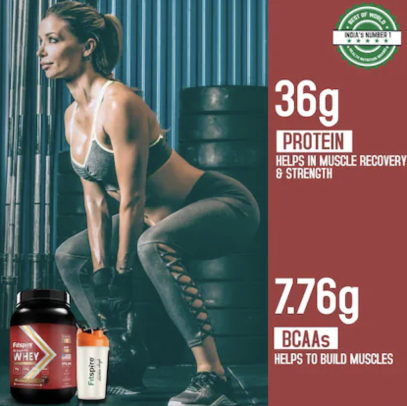
Abbreviated market research reveals limited insights on collagen-specific product pairings, positioning Shaklee’s stack as a standout story. Most category pairings focus on protein & creatine.
[Representative to show strategic methodology] Partner cross-functionally to analyze recent fiscal-quarter campaign performance, translating key insights into strategic direction for the new concepts. Include a dedicated slide outlining the quarterly marketing objectives and map how this campaign delivers against each core brand pillar.
Cross-channel analytics
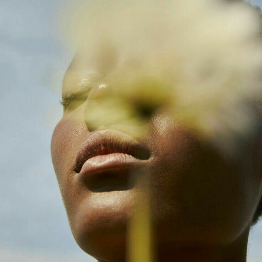
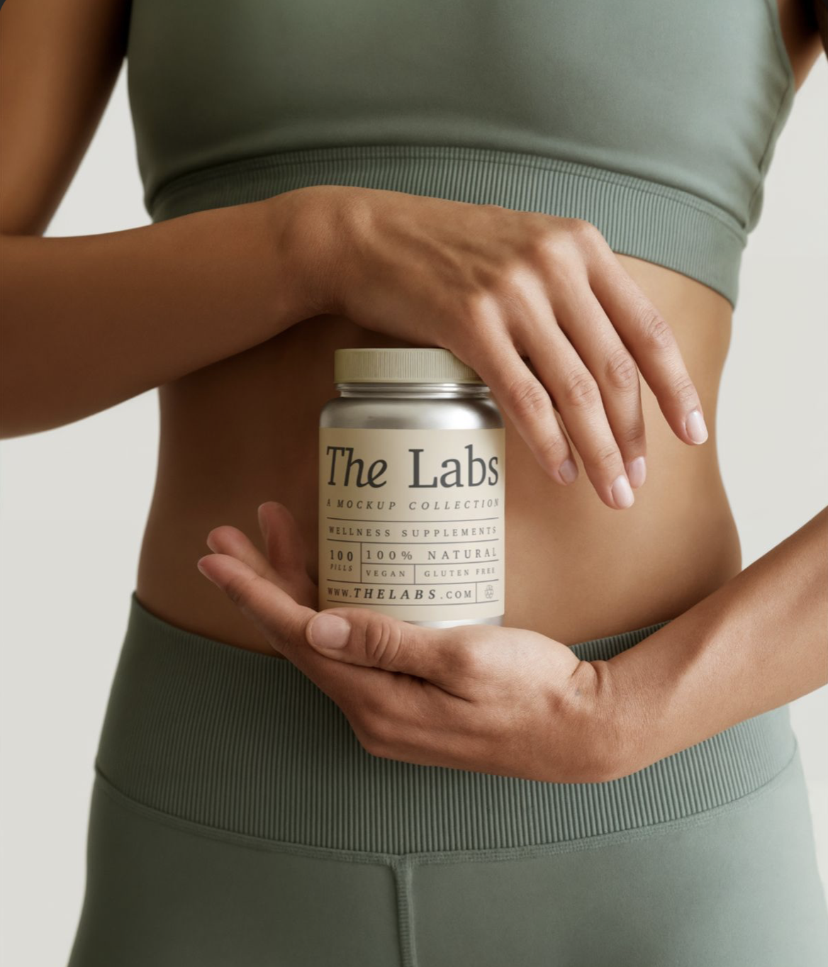
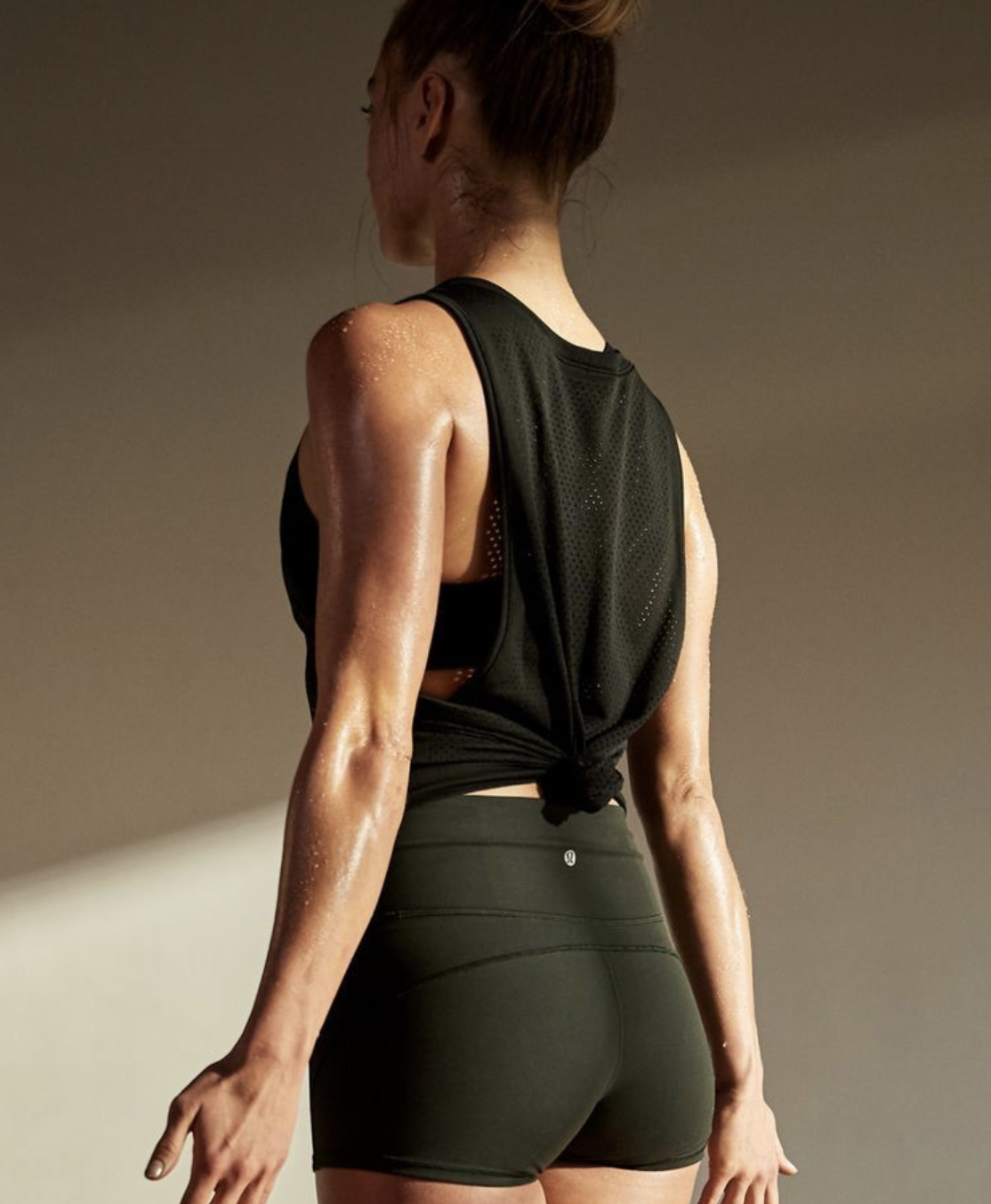
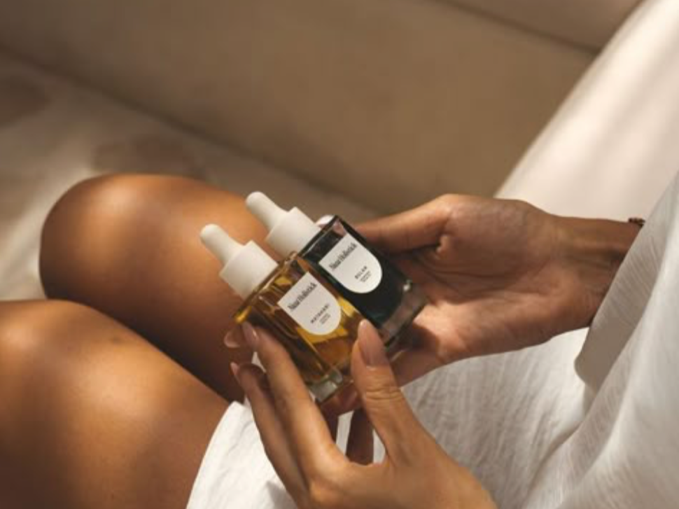
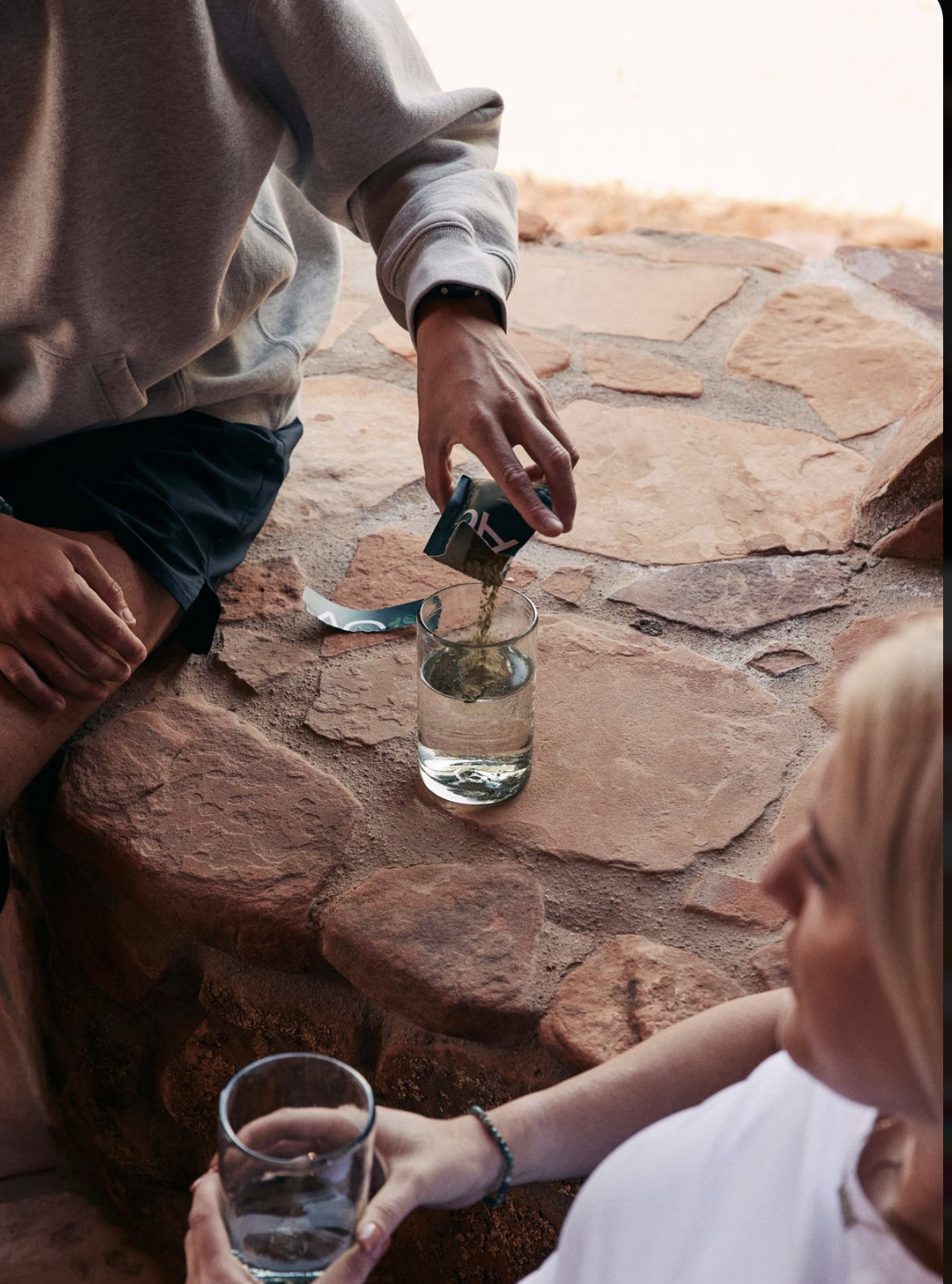
AD CAMPAIGN MOODBOARD – CONCEPT 1Fuel + Fortify
This concept simply unites the benefits of muscle building (“Fuel”) with long-term resilience (“Fortify”), strategically aligning with today’s wellness consumer who is focused on measurable strength, mobility, and sustainable longevity.
Visuals
The imagery builds on Shaklee’s established photo direction, introducing a subtle film-inspired aesthetic to create a more authentic, human tone. Consumers increasingly are moving away from overly polished visuals, and are drawn to the imperfections of real life.
Brand elements show up through color blocks, image textures, and supporting details.


AD CAMPAIGN – CONCEPT 1Headline | Subhead | Body copy | Proof points | CTA
Fuel + Fortify
Two essentials. Stronger muscle. Easier movement.
Maintaining strength and mobility as we age is essential, not optional. Stack refreshing sparkling protein with bioavailable collagen to support muscle and joint mobility. This is biological longevity, built daily.
Key Proof Points
Simple two-step daily system.
Supports lean muscle build.
Clinically studied collagen support for joint maintenance and skin elasticity.
Promotes cellular vitality.
Effervescent, refreshing protein.
Build Your Longevity Stack Today.
Experience Living Age Free →
—— Headline Option 2 –––
Strengthen + Support
Two easy steps to grow muscle and sustain mobility, from the inside out.

AD CAMPAIGN KPIs + SAMPLE TACTICS – CONCEPT 1
PERFORMANCE FRAMEWORK
Strategic product pairing transforms one-off purchases into intentional basket-building behavior, unlocking measurable incremental growth.
Attach Rate → AOV → Bundle Conversion Rate → ROAS → Incremental Revenue Lift
MLM Amplification – Brand Ambassadors
Provide starter kit bundles with savings to encourage trial.
Launch “Bring a Friend” promotions to expand reach.
Equip ambassadors with training, storytelling guides, and clear CTAs driving to the dedicated landing page.
Pop-Up Event – Gym Collaboration
Partner with national gyms or wellness franchises to host in-person micro-lounges.
Offer mini workshops led by wellness influencers and Shaklee experts.
Include sampling stations with QR codes linking to the dedicated landing page.
Capture event content on video for repurposing across channels.
Site Landing Page – Dedicated DTC Experience
Build SEO relevance with a two-part narrative for each product, including key proof points.
Feature social carousel with user testimonials and star ratings.
Highlight cross-category products as tertiary drivers.
Include clear CTA: limited-time bundle savings for new customers and subscription discounts for existing customers.
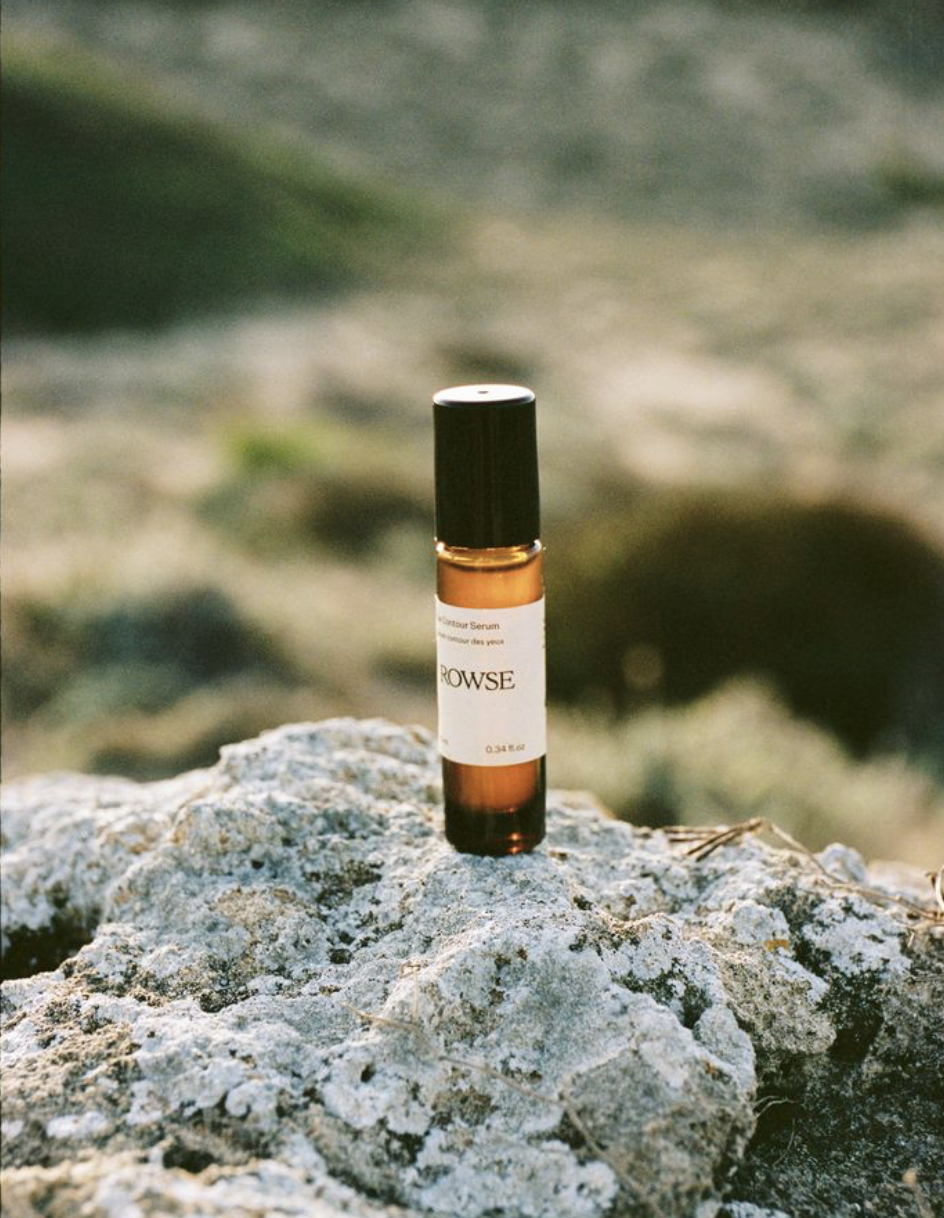
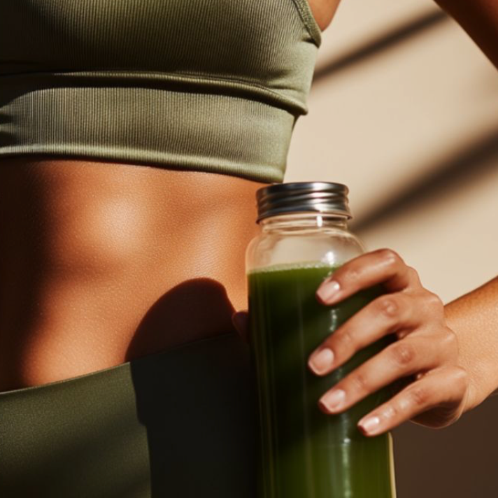
AD CAMPAIGN MOODBOARD – CONCEPT 2Daily ritual. Resilient strength.
Reframe strength and mobility as an effortless habit, positioning muscle support and joint resilience as one streamlined system. This aligns with the wellness consumer’s goal of sustainable progress without stress.
Visuals
Subtle shadowplay and enhanced highlights mirror the natural shifts of morning and evening light, reinforcing the “ritual” narrative, while the introduction of trending warmer tones adds a more human, relatable quality to the imagery.
Brand presence is expressed through color in the set design, wardrobe styling, and prop selection.
AD CAMPAIGN – CONCEPT 2Headline | Subhead | Body copy | Proof points | CTA
Daily ritual. Resilient strength.
Build muscle and mobility in just two steps.
Age isn’t surface-level. It’s muscle mass. It’s joint resilience. Sparkling Protein fuels lean strength. Liquid BioCell® Life delivers clinically studied collagen support. Together, they form a daily system designed to help you move freely and age on your own terms.
Key Proof Points
Convenient, stackable daily ritual
Supports muscle strength
Clinically studied hydrolyzed collagen
Promotes joint mobility
Helps support skin elasticity and hydration
Stack Your Strength. Live Age Free.
Shop the System →
—— Headline Option 2 –––
Two step longevity ritual
A complete daily system of strength and structure, designed to work together.
AD CAMPAIGN KPIs + SAMPLE TACTICS – CONCEPT 2PERFORMANCE FRAMEWORK
When products are positioned as a cohesive benefit system rather than standalone items, purchase behavior shifts into a system-based habit, fueling long-term incremental growth.
Attach Rate → AOV → Bundle Conversion Rate → ROAS → Incremental Revenue Lift
Paid Video Featuring Behavioral Therapist Influencer
Showcase influencer in a campaign-style story highlighting rituals that combine physical and mental wellness.
Drive exploring more about rituals as a clear call-to-action.
Distribute video across multiple channels: organic social, email highlights, MLM/local network push, and influencer-shared posts.
MLM-Driven Live Sessions
Host in-person demo events at local pilates studios, pairing brand ambassadors with each studio. Both studio and MLM network promote the event.
Offer product bundles during demos to educate and engage: Mix. Sip. Educate.
Include a behavioral influencer for a live virtual talk on “Longevity Rituals.”
Drive the MLM audience to a dedicated event landing page for registration and follow-up.
SITE – Dedicated Event Landing Page
Highlight in-person experiences and help users locate local brand ambassadors (primary message).
Showcase product pairings featured at various events with clear, detailed benefits (secondary message).
Include tertiary prompts to explore cross-category products.
© 2026 Marissa Hobson. All creative concepts, artwork, and strategy in this case study are original work and shared for Shaklee conceptual ideation purposes only. Not for reproduction or use without written permission.Revisioned packaging concept
New visual packaging design for Liquid BioCell® Life, applied as mockup concept.
-
Remove Modere branding.
Align to Shaklee brand codes.
Elevate product to a premium longevity aesthetic.
No changes to package substrate or legal claims.
-
Science-forward longevity + modern beauty-wellness.
-
One-page ad concept (copy + visual description).
Liquid BioCell® Life packaging direction rough mockup.
No finished artwork. Clarity of creative process is priority.
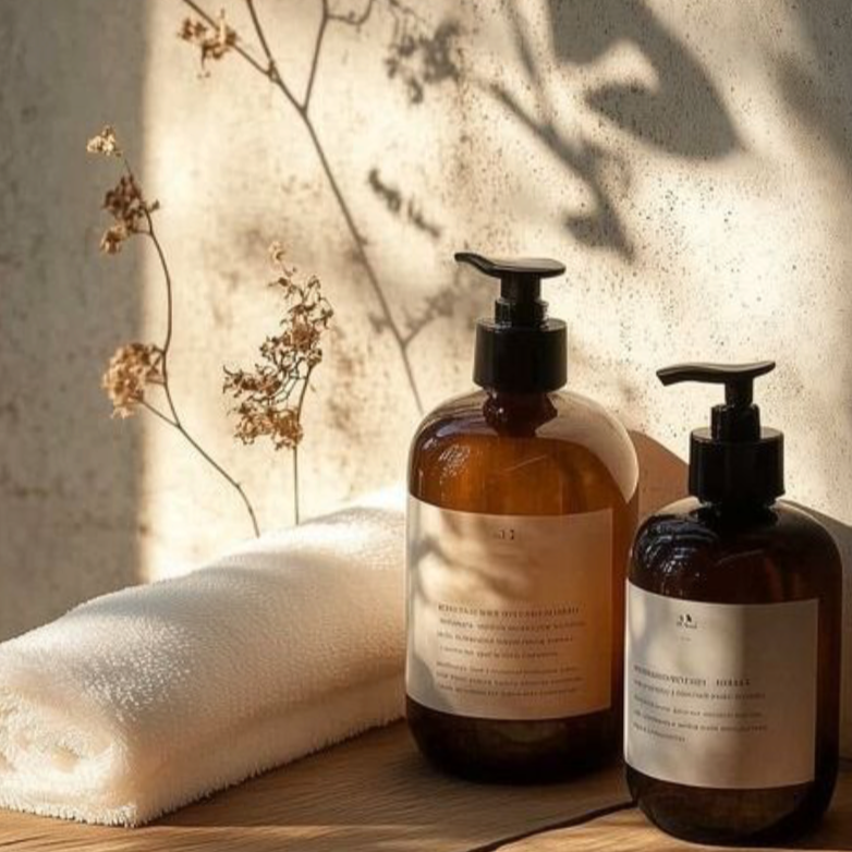
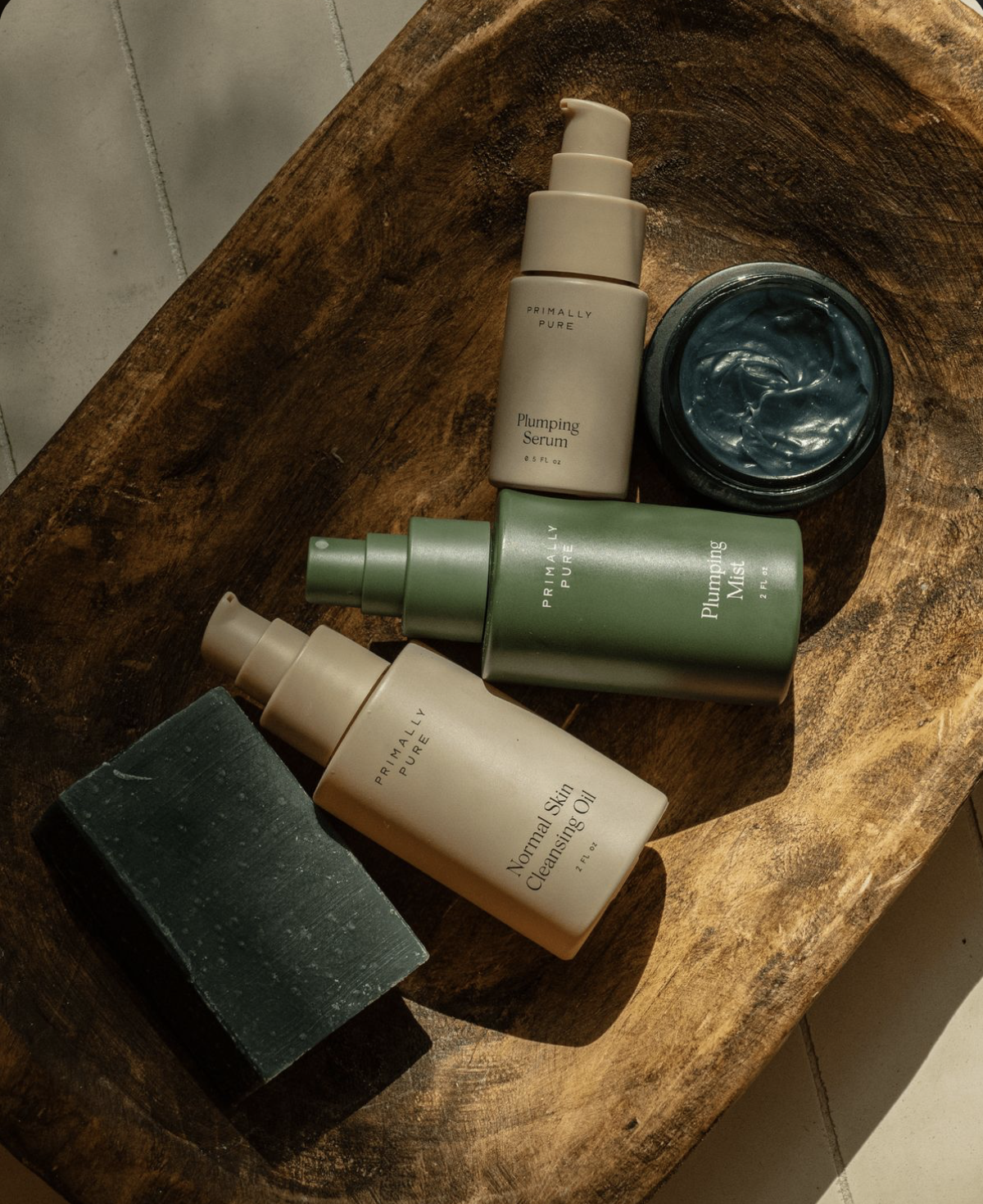
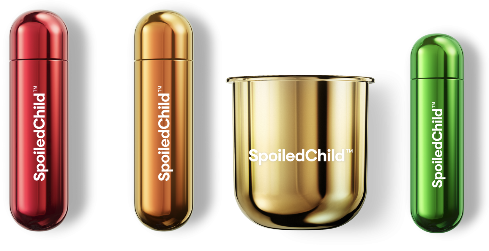
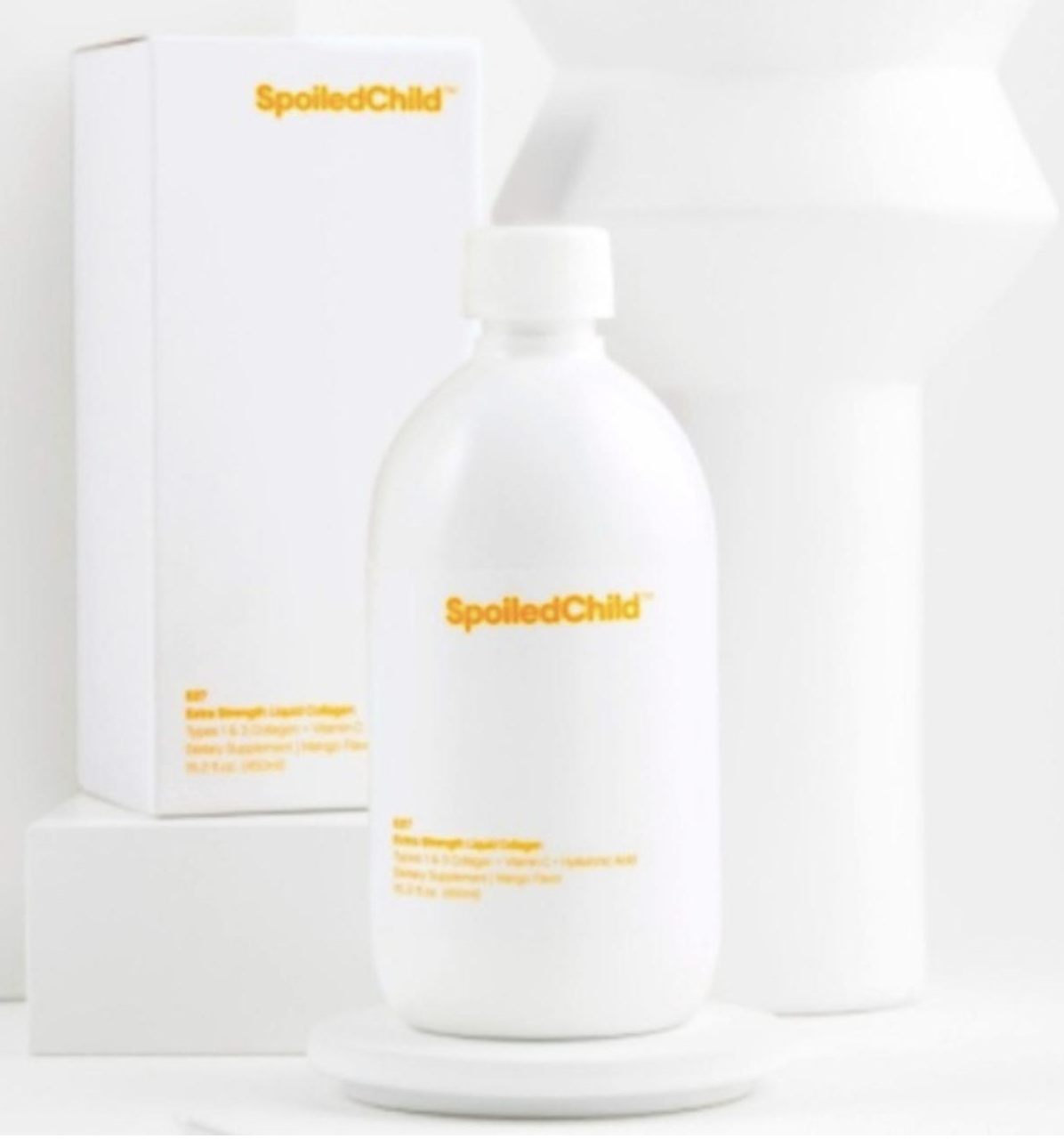
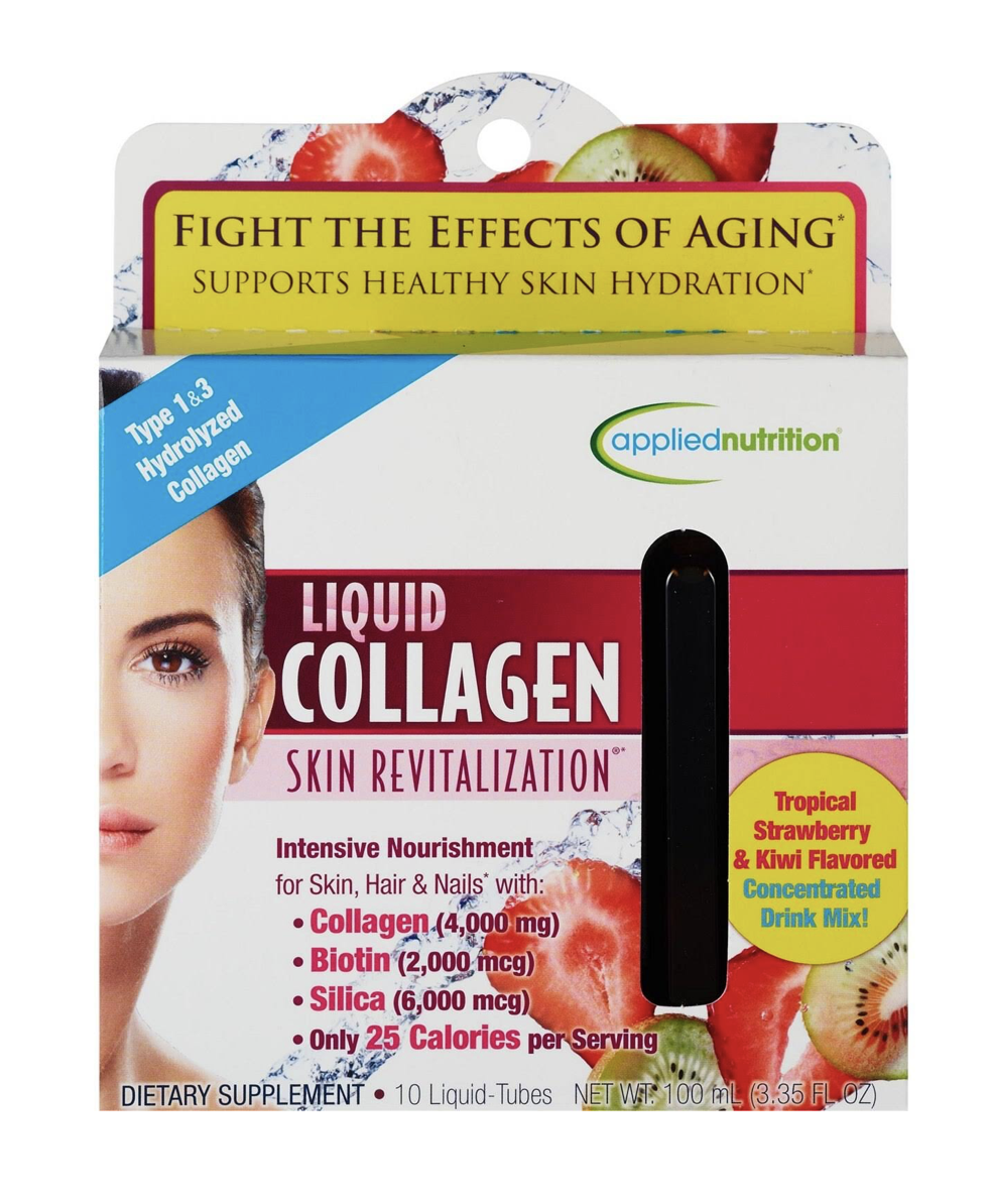
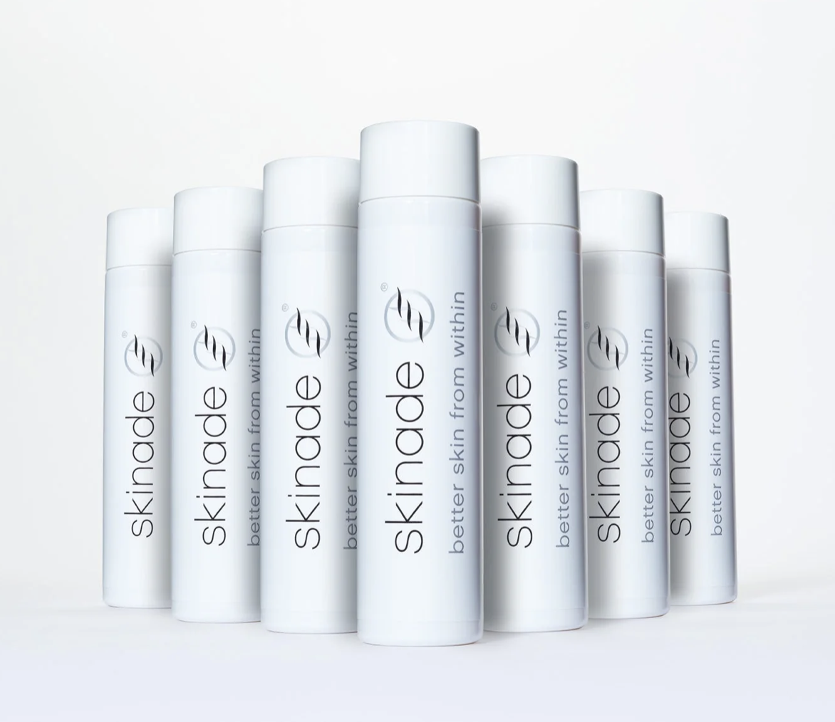
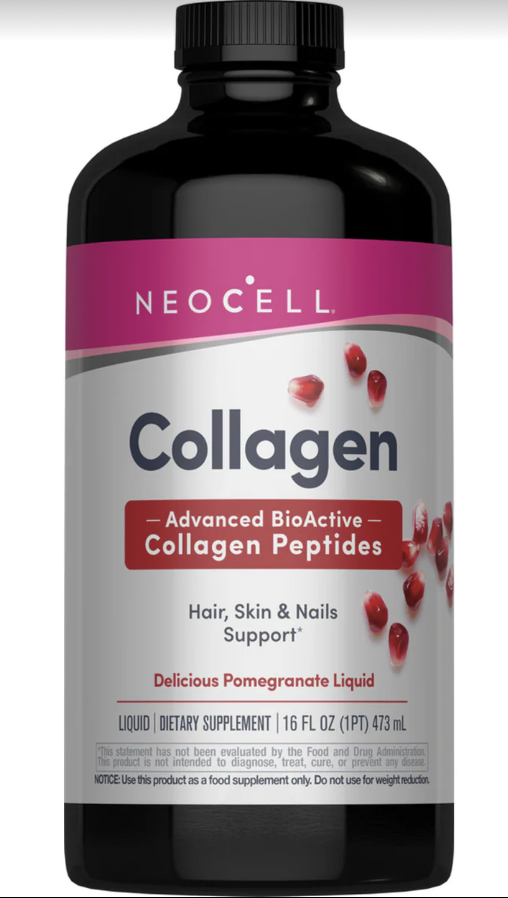
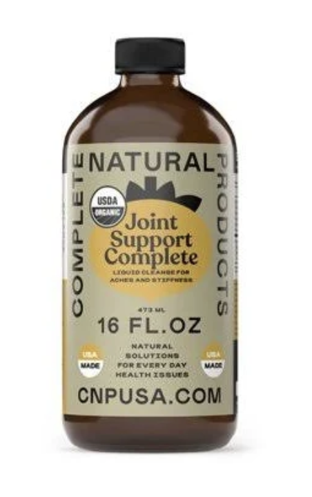
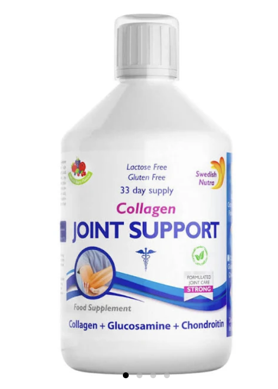
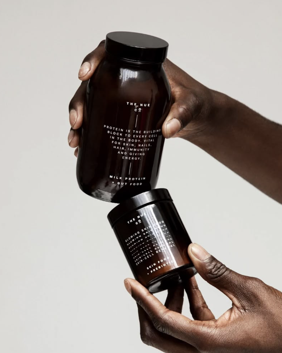
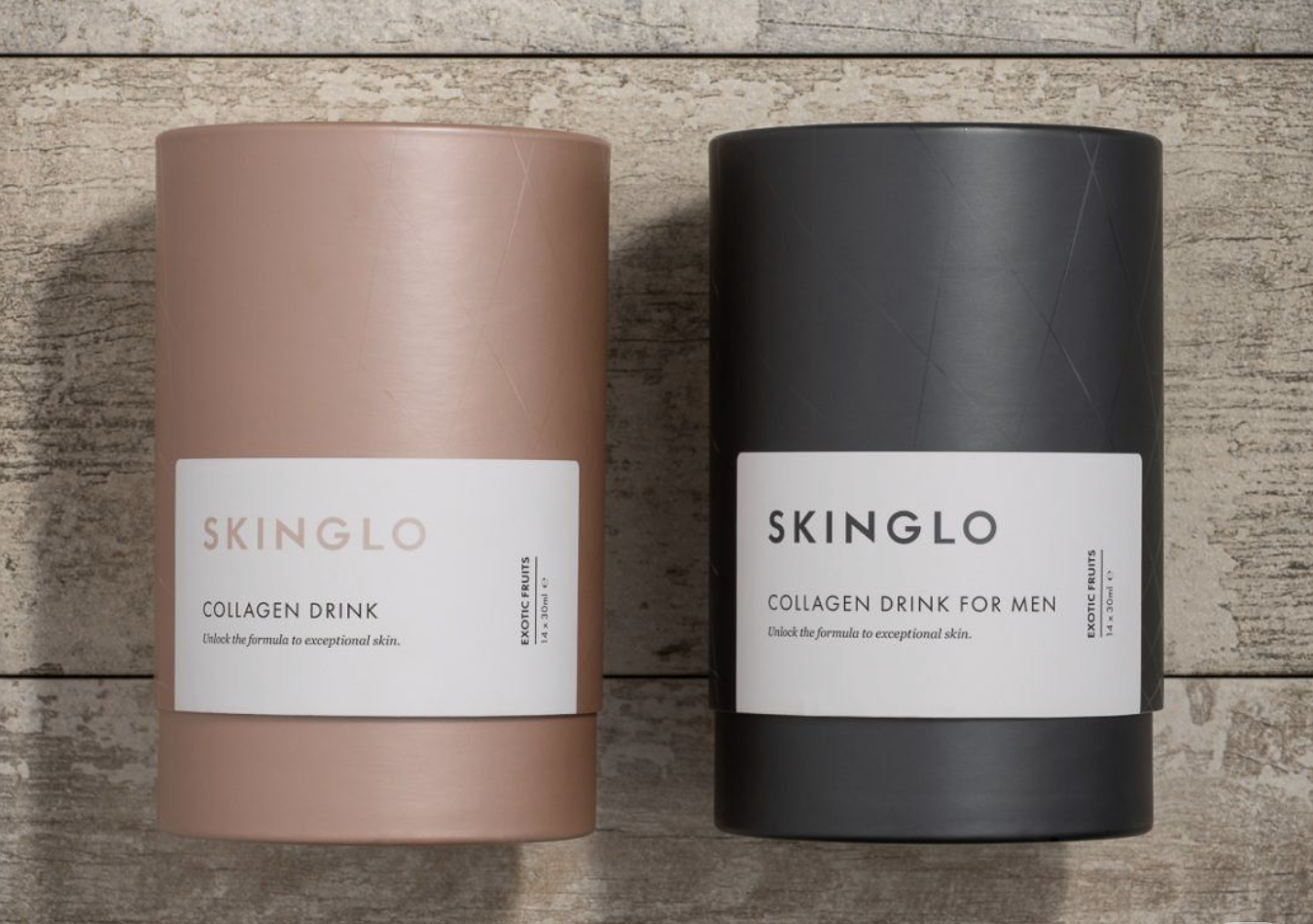
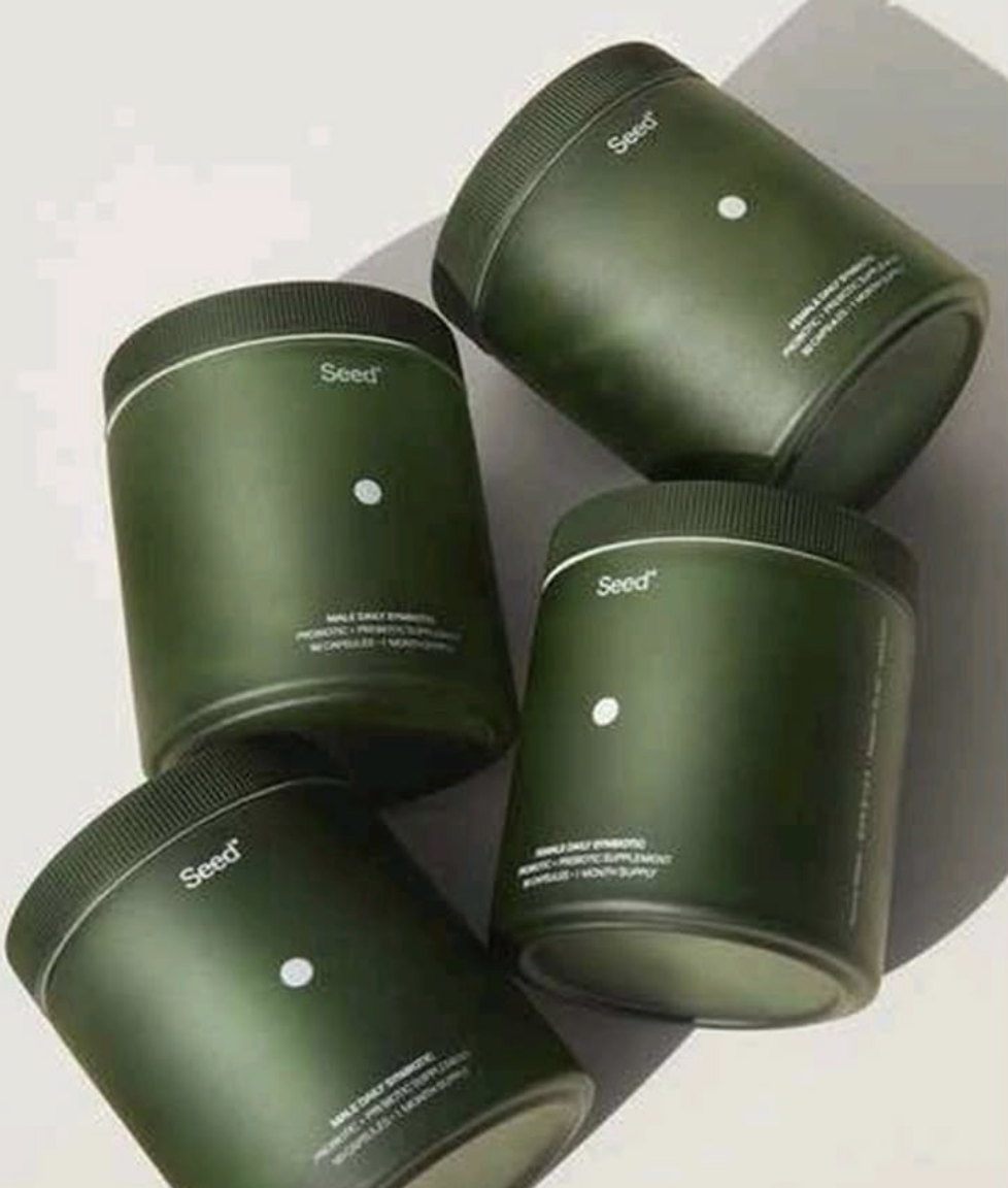
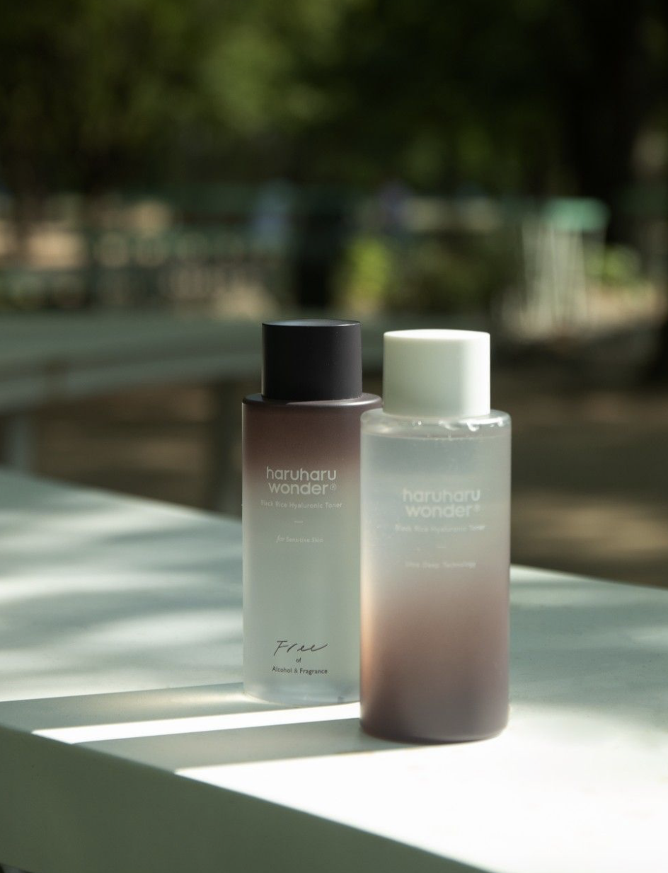
Market & competitor analysis
An abbreviated review of top-selling U.S. liquid collagen products, featuring an emphasis on joint health. Packaging designs vary from a modern beauty aesthetic, to traditional clinical-inspired. This spectrum illustrates how brands balance different consumer audiences.
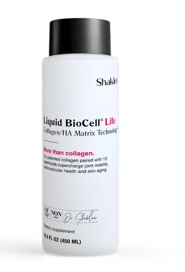
PACKAGE DESIGN MOODBOARD – CONCEPT 1Relevant. Sophisticated. Trusted.
Combining the two leading design directions identified in the market analysis, the approach blends modern minimalism with subtle cues of clinical credibility.
A restrained color palette maintains brand cohesion within the category, while introducing more distinctive Shaklee brand elements, such as left-aligned typography, to strengthen brand recognition and differentiation.

PACKAGE DESIGN MOCKUP – CONCEPT 1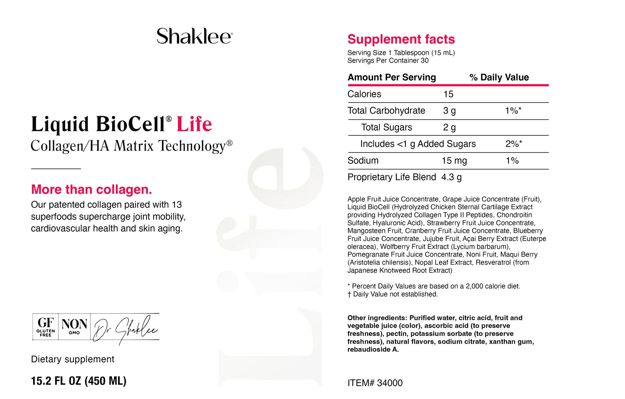
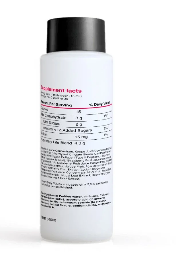
Build on Shaklee’s existing cross-category packaging system, extending established visual language to create cohesive brand recognition for the collagen portfolio.
Retain the signature red from the existing ‘Life’ bottle to preserve its earned brand equity and recognition.
Rework copy to highlight the key differentiator of this collagen delivering multiple benefits beyond typical collagen: ‘More than collagen’
Elevate printing technique with an oversized, vertical clear-gloss logo along the side of the bottle for a premium finish and added visual interest.
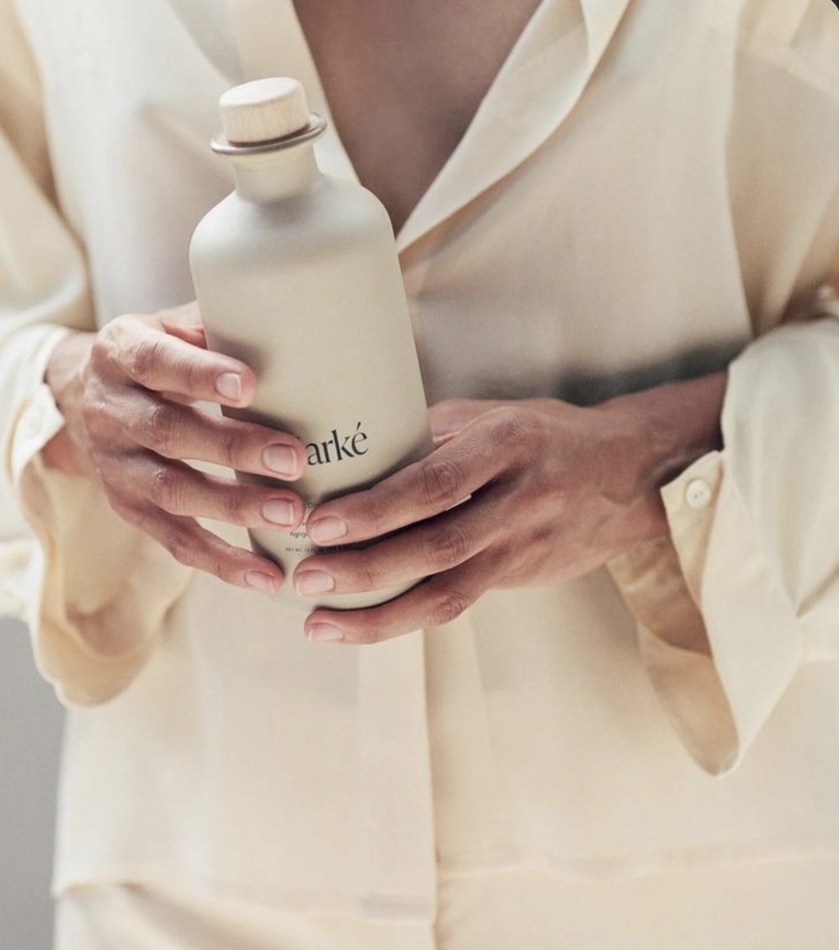
PACKAGE DESIGN MOCKUP – CONCEPT 2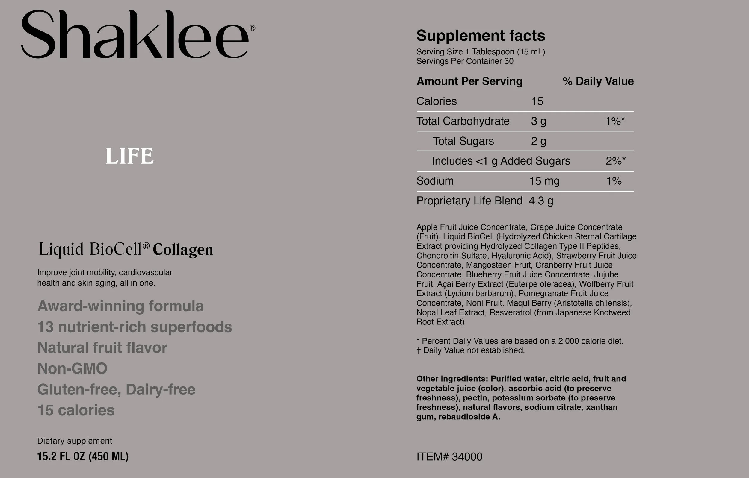
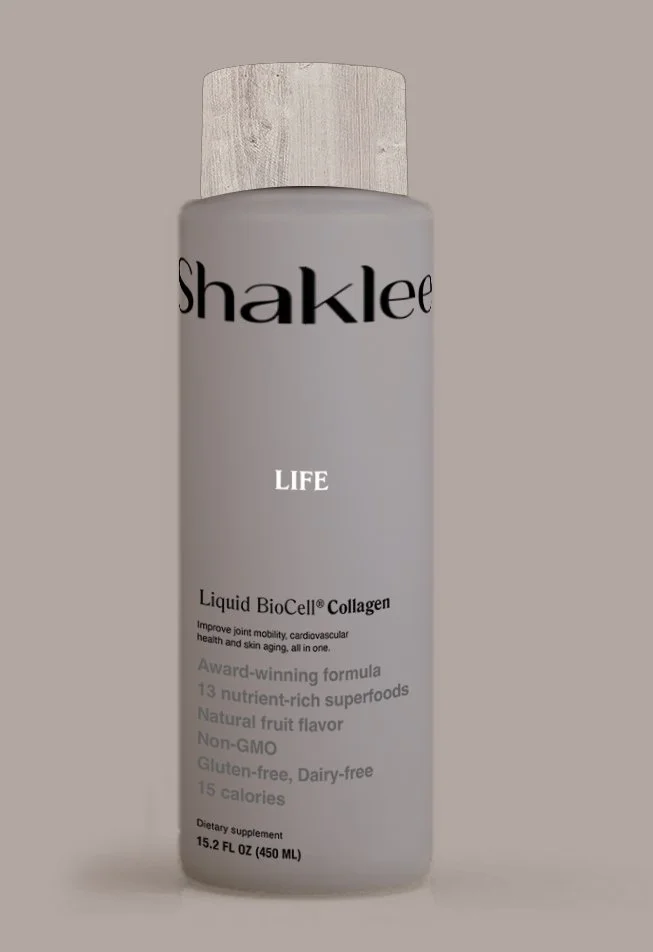
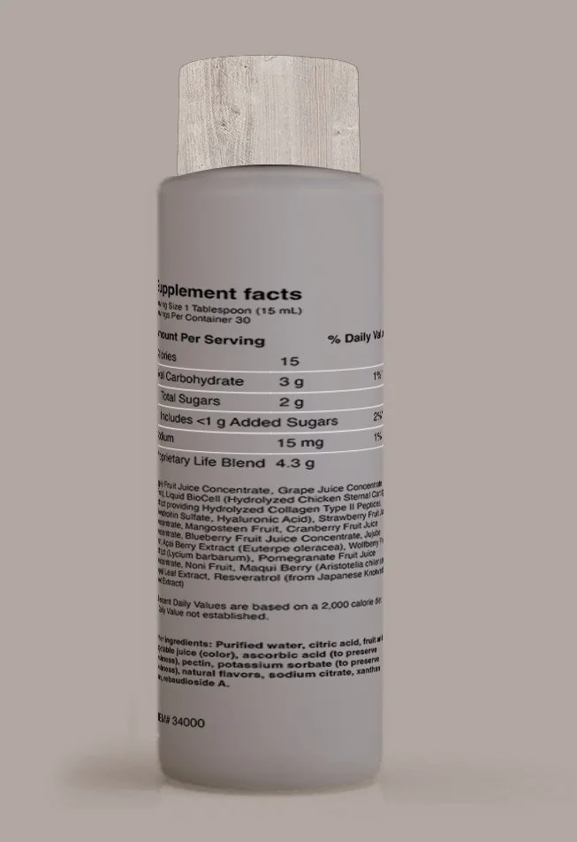
Maintain Shaklee’s signature graphic elements of existing fonts and left-aligned layouts, while enhancing the system by repositioning hierarchy. Shift the product title ‘Life’ as primary, and feature ‘Collagen’ more prominently, for faster identification.
Amplify on-shelf brand presence by featuring an oversized ‘Shaklee’ logo that wraps the top of the bottle, driving instant recognition and brand resonance.
Highlight the product identifier (‘Life’) in bright white, creating a subtle yet sophisticated pop against the calming, soft, stone gray color bottle.
Amplify the existing packaging design through refined material and print upgrades of introducing a faux-wood printed cap, and transitioning the bottle substrate to a matte, soft-touch finish for an elevated, tactile experience.
PACKAGE DESIGN AD CONCEPT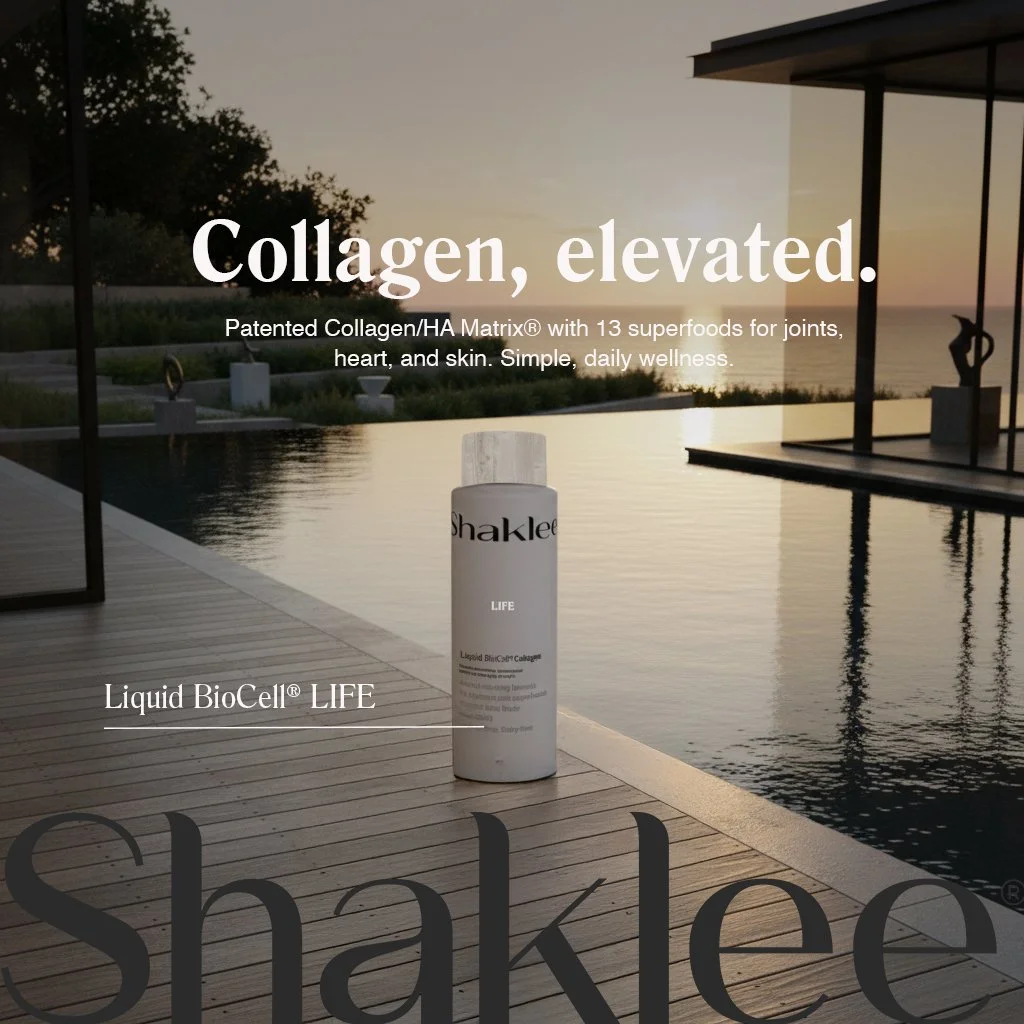
© 2026 Marissa Hobson. All creative concepts, artwork, and strategy in this case study are original work and shared for Shaklee conceptual ideation purposes only. Not for reproduction or use without written permission.